Signal vs. Noise
“Do only what is necessary to convey what is essential.”
In Presentation Zen Design (see also Type Zen), Garr Reynolds continues to apply Zen aesthetic principles to business presentations. One chapter focuses on preparing effective charts and graphs. Reynolds urges readers to avoid clutter and overly-complicated charts and graphs that will distract viewers from the relevant data.
He outlines three key principles: restraint, reduce, emphasize.
• Restrain yourself from including unnecessary information (logos, decorative items, overly-detailed data).
• Reduce the non-essential elements by being very clear about the purpose of the graph and what it is intended to illustrate.
• Then emphasize the most important information: colour to highlight the most important bar in the graph, a heading to direct attention to the data’s significance.
It is so easy to want to draw a pretty picture – to include lots of colour and graphics – or to drown your viewers in information to show how knowledgeable you are. Reynolds drives home the point that less is more. Use one colour boldly to emphasize a particular section of the data. Save complicated data for a handout. Simple, clear slides will allow your data to make an impact.
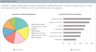
You can test your Graph Design IQ with an online test on the website of Stephen Few, author of Show Me the Numbers: Designing Effective Tables and Graphs.
And, for a look at future directions in data visualization, check out Hans Rosling’s amazing animated charts – for example, here’s a 4-minute history of the world.


Comments