Writing with Harmony and Balance
 Why am I spending so much time thinking about design? I’m a writer, after all. I deal with words, not graphics.
 First of all, how you place the words on the page makes a tremendous difference. Layout and design highlight the important messages and make it easy to understand the message. Well-designed documents get read – poorly-designed ones don’t.
But design moves beyond physical layout and formatting. In Presentation Zen Design, Garr Reynolds outlines 10 Japanese aesthetic principles that I aspire to instil in my work.
Kanso – simplicity or elimination of clutter. Clarity rather than decoration.
Fukinsei – asymmetry or irregularity. Balanced asymmetry is both dynamic and beautiful.
Shibui/Shibumi – understated. Elegant simplicity, articulate brevity.
Shizen – natural, without pretence or artificiality. It may appear to be accidental, but it is actually planned and intentional.
Yugen – suggestion rather than revelation. A Japanese garden, for example, is a collection of subtleties and symbolic elements, showing more by showing less.
Datsuzoku – Freedom from habit or formula, transcending the conventional. The surprise and amazement we feel when we are freed from the conventional.
Seijaku – tranquillity, stillness, energized calm.
Wa – harmony, peace, balance.
Ma – spatial void, interval of space or time. The pauses in the music.
Yohaku-no-bi – beauty that is implied, unstated or unexpressed. Focussing on what is left out.
One final quote from Garr Reynolds: “design is not about dazzle, sizzle, or slickness. Design is about clarity, evidence, engagement, and story. If the content has structure, if it’s true and honest and designed with the audience (or end user) in mind, then chances are it will be an attractive design as well. It’s not an issue of substance over style. The issue is how we design visuals (and other messages) that are in balance and in harmony with our narrative in a way that amplifies and augments our spoken words.”
See Also:Type Zen
Signal vs. Noise
Avoid Visual Clutter


Comments
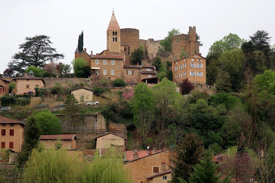
And, is that photo from the Sun Yat Sen Gardens?