Posts

Showing posts from June, 2010

Killer Web Content: Trains, Tickets, Toilets

Image
I magine you are on the escalator in a train station. As you scan the signs, there are only three that really matter – Trains, Tickets and Toilets. In Killer Web Content , Gerry McGovern recommends keeping this in mind as you develop the content for your website. Website readers want very clear messages that directly meet their core needs. For example, McGovern compares the content that different groups hope to find on an educational website. Government officials were looking for reports and policies. Teachers were looking for lesson plans. Parents were looking for information about how the schools would support and protect their children. McGovern believes that you can’t satisfy everyone. You need to identify your primary audience, find out what really matters to them – what they care about – and then develop your web content accordingly. “Don’t fall into the trap of assuming that, just because you passionately care about something, your customer will. This is one of the biggest

Killer Web Content: Successful Websites are Task-Focused

Image
“ The vast majority of people come to your website to do something specific, and they want to get in and out as quickly as possible. Identifying the most important tasks that people come to your website to complete, and helping them do so as quickly and efficiently as possible, will be critical to the success of your website .” (Gerry McGovern, Killer Web Content) I was so excited when the Saskatoon Public Library got new software for reserving books and managing your account. But then I started using it, and I was horribly disappointed. They have fixed some of the most glaring errors, but it is still an unfriendly website. There are two different search features that are linked so the results can look different every time you enter the system. Important buttons are located in at least three different positions so I have to hunt for them. And there’s a reason why all the books I reserve come from Regina – Saskatoon staff haven’t been able to buy books online for the last six months.

Blue Bread and Penguins

Image
Playful marketing and playful products are a delight. Penguin Biscuits A package of McVitie’s Penguin chocolate-covered biscuits was an impulse purchase, but it brought back happy memories of bus journeys in England. And the packaging is such fun. A playful penguin on the front and a joke on the back: “How does a penguin make pancakes?” “With its flippers.” The website has three sections: Fun Stuff (submit your own joke), Working in Antarctica, and All About Penguins. These are not world-class biscuits, but it’s world-class advertising. Blue Bread There were new varieties of bread to choose from at Earth Bound Bakery (8th Street, Saskatoon) on Saturday. The blue corn bread caught my eye, and Trent, the baker, told me how much fun he had kneading it because of the colour. It tastes great too. I have to put in a plug for Earth Bound – great organic products fresh from the oven – we buy their bread and croissants (and sometimes their cinnamon buns) every week. And I actual

Public Speaking Tip #5 Rehearse Until You're Confident

Image
“Practice isn’t the thing you do once you’re good. It’s the thing you do that makes you good.” (Malcolm Gladwell) Nobody just walks out on the stage and makes a great speech. Practise so that you can work out problems in advance. Know your material inside and out by rehearsing your presentation over and over and over again. Catch and fix errors. Improve the sections that don’t flow properly. “Confidence, not perfection, is the goal,” explains Scott Berkun. Experienced presenters recommend identifying and memorizing the key words and phrases for each segment of the presentation. You should also memorize the most important points from your introduction and closing and be very sure of the sequence and connections between the different segments of your speech. If you have memorized your key points, you’ll be confident enough to improvise and respond to unexpected events (equipment failure, tough questions, bored audience). Practise using the equipment as well – a new laptop, new pr

Connect with your Reader: Writing and Gestalt: Part 2

Image
Resolve Ambiguities, Impose Structure, Make Connections In the 1920s a group of German psychologists studying visual perception learned that the human brain seeks patterns. We don’t see objects in isolation; we see them as part of a greater whole, and we make connections between the individual parts. In fact, we often “see” things that aren’t really there because we are trying so hard to create unity and closure. This is the second of two blog posts ( Gestalt for Writers: Part One ) about applying gestalt principles to written text. Similarity If three sections of text are in blue ink and one section is in red, two things happen. First of all, readers will assume that the blue sections are related because they look the same. Secondly, the section in red will stand out and be perceived as more important because it’s different and because red symbolizes urgency. Symmetry We are very aware when designs are symmetrical and asymmetrical. In fact, we crave symmetry. A doorway with a

Connect with your Reader: Writing and Gestalt: Part 1

Image
Resolve Ambiguities, Impose Structure, Make Connections Text doesn’t exist in isolation. It is part of a page or a computer screen. And the way the words are organized on the page affects the way they are perceived. In the 1920s a group of German psychologists studying visual perception learned that the human brain seeks patterns. We don’t see objects in isolation; we see them as part of a greater whole, and we make connections between the individual parts. In fact, we often “see” things that aren’t really there because we are trying so hard to create unity and closure. The psychologists called their studies “gestalt,” which means “unified whole,” and they established a set of principles that are widely used by graphic designers but are also relevant for writers. The next two blog posts will explore some of the key concepts and how they apply to writing. Proximity If some words or objects are placed more closely together than others, they will be perceived as a group. We use this

5 Tips for Eye-Catching Resume Cover Letters

Image
Resume cover letters can be very boring – mine have been in the past. The next time, I’ll keep these five points in mind. See what you think – maybe they can help you as well. Focus on the Employer and the Future The cover letter shouldn’t duplicate the resume. While the resume focuses on you and your past accomplishments, the cover letter should focus on the employer and the future. Your goal is to clearly illustrate the value that you can bring to their company. In Brazen Careerist: New Rules for Success , Penelope Trunk says that every line of your resume should include a specific reason for hiring you. Keep it Short and Punchy Keep your cover letter short and memorable. Provide the employer with sound bites that help them identify and remember why they want to hire you. Convey personality and enthusiasm. One effective way to do this is by recounting a specific incident – for example, how you discovered the importance of occupational therapy as a first-year Candystriper or

Corporate Storytelling: Strategic Planning

Image
Two of my favourite topics – storytelling and Roger Martin. Moving from Strategic Planning to Story Telling Strategic planning can be a painful process – SWOT analysis, financial spreadsheets, the fear of putting forward and defending your ideas. There is so much focus on what is practical and so much competition amongst units, that the resulting plan is often mundane and uninspiring. Roger Martin recommends a different approach: “ My solution? Think about a strategic option as being just a happy story about the future. It doesn't have to be right and it doesn't even have to be sensible. It just has to result in your organization being in a happy place in the future. In fact, if it were absolutely right and utterly sensible, your company would probably already be doing it. It doesn't have to be constructed analytically. It is a holistic story — here is where we would find ourselves playing and how we would see ourselves winning. The only real requirement is that i

Corporate Storytelling: The Partnership Story

Image
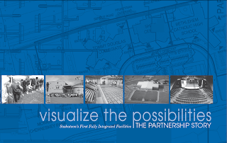
Visualize the Possibilities: Saskatoon's First Fully Integrated Facilities Over the past five years, the City of Saskatoon partnered with Greater Saskatoon Catholic Schools, Saskatoon Public Schools, the Saskatchewan Ministry of Education and Saskatoon Soccer Centre Inc. to design, construct and operate two integrated community facilities. I was hired to interview the key stakeholders and to prepare a report outlining the benefits and key factors involved in creating a successful partnership. It was a fabulous project to work on. By talking to representatives of each of the partner organizations, I was able to understand the partnership from their individual perspectives. And I tried very hard when preparing the report to let their voices be heard. Facts come to life when they are given a human voice. The report has now been published and is available in print or online. My thanks to Sandi, Joy and Donella (as well as Carla and Jennifer) who were a delight to work with.

SK Craft Council’s Glass Garden

Image
The Saskatchewan Craft Council’s gallery on Broadway Avenue in Saskatoon has been transformed into a garden with the fantastical flowers and vines designed by Susan Rankin . There are tall columns of leaves, vases and epergnes covered in flowers, and wire form landscapes. The Valid Objects of Beauty exhibit will be on display at the Craft Council from June 4 through July 11 . The gallery is open daily from 1-5 . “Every piece of design must have a combination of something that’s familiar and something that’s surprising. The familiar gets us in the door, and the surprising keeps us engaged.” ( Brian Collins )

Public Speaking Tip #4

Image
Meet your audience’s needs Here's some valuable advice from Confessions of a Public Speaker by Scott Berkun: “The things speakers obsess about are the opposite of what the audience cares about. They want to be entertained. They want to learn. And most of all, they want you to do well. Many mistakes you can make while performing do not prevent those things from happening. It’s the mistakes you make before you even say a word that matter more. These include the mistakes of not having an interesting opinion, of not thinking clearly about your points, and of not planning ways to make those points relevant to your audience. Those are the ones that make the difference. If you can figure out how to get those right, not much else will matter.” “Even a topic as mind-numbingly dull as tax forms becomes interesting if the speaker cares both about the problem and the people affected by it.” – e.g. ‘Here’s line 5 of the new tax form’ versus ‘80% of you in the audience confused line 5 wit

Content Design: Serendipitous Word Placement

Image
Writers tend to believe that the words themselves are all important. But it’s becoming increasingly obvious to me that how you place the words on the page is equally, if not more, important. I’ve been looking at magazine layouts and analyzing why some layouts work for me while others don’t. I realized that I’m attracted to collages that assemble a variety of different items – text, photos, graphics. The juxtaposition is often unexpected but compelling. It’s also an opportunity to use small pieces of information that wouldn’t be significant on their own but are effective as part of a larger piece. A unifying theme creates unity out of diversity. Here are some examples: The road map pulls together an assortment of information about the Florida Keys. The combination of photos, objects and text is emotionally appealing. An assortment of sticky notes is an interesting way to integrate short pieces outlining various celebrities’ dream vacations. You don’t need photographs to create a

Customer Service

I work for a software company that prides itself, and very rightly so, on providing great customer service. They customize the program to meet their customers’ needs, and they spend hours on the phone helping customers with their problems. And it’s tough. The customers’ requests often seem unreasonable. As Gerry McGovern points out in a great blog post, the customer is a stranger so we can never really understand their point of view. The essential challenge of the Web is to become customer-centric. To truly succeed on the Web the organization must shape itself around the customer. This is very difficult for any organization to do because at heart all organizations are tribes. And the one thing a tribe does not like to do is shape itself around the stranger, the outsider. The customer is a stranger, an outsider, and the customer is more in charge on the Web than the organization is. This is the essential shift in power and control that organizations must embrace if they are to thri

Meetings - Active Participation and Tangible Results

Image
A colleague mentioned in an email that meetings are the bane of his existence. I’m sure many of us agree with him, so I thought I’d share some tips I’ve come across for ensuring that the time we spend in meetings is worthwhile. The Three-Purpose Meeting Rule In The Key to Shorter, Better Meetings , Anthony K. Tjan recommends an action-oriented agenda that focuses on what you expect from meeting participants: “Consider a meeting that sets its agenda goals along the lines of: ‘I want to bring you up to speed on these two things; I need input on this item; and finally I would like to seek your approval on these outstanding issues.’” Stealth Meeting Facilitation Melissa Raffoni has written a great article on Stealth Meeting Facilitation for the Rank-and-File to help participants fix the meeting from hell: If the conversation becomes really muddled, Raffoni suggests playing dumb and asking for an explanation. But the trick is to specifically address your request to the person in the

Communicating with Numbers #3

Image
Use Numbers to Enhance not Disguise the Facts A lot of people are intimidated by numbers. As writers, we know we need to include data/statistics in our material, but we’re not really comfortable with them so they’re added hastily without a great deal of thought or understanding. We add a colourful chart because it will brighten up the page, or we stick in a few statistics. Premium on Numbers In Hungry for Numbers, Allergic to Data , Steven DeMaio says, “In publishing circles today, there’s a premium on numbers. Editors, writers, and journalists often seek to crystallize or legitimize a story with an eye-popping statistic that will become the sound bite or “takeaway” of the piece. Yet most of these professionals have an aversion to examining the underlying data developed by expert authors or sources. Sometimes proudly asserting “I’m a word person,” they soil their hands with numbers just enough to make the story work but refuse to learn what the data really mean. In many cases, they

Paint Me a Picture

Image
Our minds quickly discard jargon and abstract language, but images and stories capture our imagination. Here’s what grabbed my attention at the wine store this weekend: Fats Johnson, Prospect Winery “A kindly older neighbor, Fats Johnson was known for loading donuts onto a long pole, and giving them away to kids as they rode by on their bicycles. His dog Tupper was a constant companion, and always by his side.” The Big Take, Misconduct Wines “A late night bull session leading to a caper of grape proportions. All dolls, molls and bearcats aside, they’re on the lam and the race is on to get the hooch harvest back to the joint. The berries are ready and the clams have been exchanged. All that’s left is to take the grapes for a ride and not get pinched.” Lost Angel Wine, Eos Vintage “Legend has it an angel came down from the sky to explore the garden of earthly delights and lost her way home. Tired of searching, she created her own paradise in the region now known as Paso Robles