Prairie Ramble: Contemplative Communication
I played hooky this morning and went for a walk in the country. Now, people who don’t live on the Canadian Prairies tend to think they are flat and boring. But that just isn’t the case if you take the time to walk slowly and look carefully.
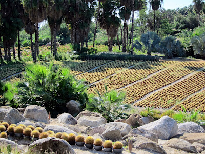
There were so many tiny flowers blooming along the paths – early blue violet, American vetch, golden-bean, late yellow locoweed, and prairie onion (slideshow below). There were baby ducklings on the river, and five deer were startled but curious about my presence. And, completely unexpected, I found a small patch of morel mushrooms when I bent down to take a photograph.
Business Writing
As I observed the river’s gentle, circular currents, I thought about how business writing is so often forced to be loud and showy in order to catch the attention of busy people. But what if we want to create a document or website that still captures people’s attention but encourages them to slow down and look and think?
Here are some tools that I think would slow the reader down so that they spend time with the material. I would be interested to know what has worked for you.
• Leave lots of white space.
• Have several minor focus points distributed across the page rather than one central focus.
• Use calming colours and graphics.
• Partial images – a face in silhouette, a deer only partially visible through the trees – will invite viewers to stop and look more closely.
• Use visual elements to quietly direct the readers’ attention from one spot to another (e.g. a person in one image is looking at a section of text).
• Create balance and harmony between the different elements on the page.
• Use curiosity and surprise to attract attention. For example, the poetry of Gerard Manley Hopkins combines words in evocative, imaginative ways: “Praise be to God for dappled things - / For skies of couple-colour as a brinded cow; / For rose-moles all in stipple upon trout that swim;”
Zen Design
I am a great admirer of Garr Reynolds. His most recent book, Presentation Zen Design: Simple Design Principles and Techniques to Enhance Your Presentations , discusses Japanese aesthetic principles as well as Gestalt – valuable ideas for creating harmony and simplicity in our communication.
See also: Avoiding Visual Clutter
Writing with Harmony and Balance
There were so many tiny flowers blooming along the paths – early blue violet, American vetch, golden-bean, late yellow locoweed, and prairie onion (slideshow below). There were baby ducklings on the river, and five deer were startled but curious about my presence. And, completely unexpected, I found a small patch of morel mushrooms when I bent down to take a photograph.
Business Writing
As I observed the river’s gentle, circular currents, I thought about how business writing is so often forced to be loud and showy in order to catch the attention of busy people. But what if we want to create a document or website that still captures people’s attention but encourages them to slow down and look and think?
Here are some tools that I think would slow the reader down so that they spend time with the material. I would be interested to know what has worked for you.
• Leave lots of white space.
• Have several minor focus points distributed across the page rather than one central focus.
• Use calming colours and graphics.
• Partial images – a face in silhouette, a deer only partially visible through the trees – will invite viewers to stop and look more closely.
• Use visual elements to quietly direct the readers’ attention from one spot to another (e.g. a person in one image is looking at a section of text).
• Create balance and harmony between the different elements on the page.
• Use curiosity and surprise to attract attention. For example, the poetry of Gerard Manley Hopkins combines words in evocative, imaginative ways: “Praise be to God for dappled things - / For skies of couple-colour as a brinded cow; / For rose-moles all in stipple upon trout that swim;”
Zen Design
I am a great admirer of Garr Reynolds. His most recent book, Presentation Zen Design: Simple Design Principles and Techniques to Enhance Your Presentations
See also: Avoiding Visual Clutter
Writing with Harmony and Balance
 |
| Spring on the Prairies |


Comments
I agree with the 'less is more' approach. Like those soft-spoken people who really command attention.